D4.2 Effective Visualisation
Objectives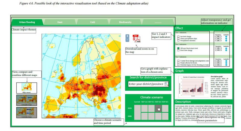
The objective of this deliverable is to develop guidance for user friendly visualisations:
1) to improve the communicative power of the data and indicators;
2) to visualise uncertaintyuncertainty
Lack of precision or unpredictability of the exact value at a given moment in time. It does not usually imply lack of knowledge. Often, the future state of a process may not be predictable, such as a roll with dice, but the probability of finding it in a certain state may be well known (the probability of rolling a six is 1/6, and flipping tails with a coin is 1/2). In climate science, the dice may be loaded, and we may refer to uncertainties even with perfect knowledge of the odds. Uncertainties can be modelled statistically in terms of pdfs, extreme value theory and stochastic time series models. information.
Deliverable 4.2 takes the user requirements following from WP2 into account and analyses what visualisations would be effective considering these preferences. It also takes into account the work done in WP6 regarding uncertainty visualisation.
Results
By making use of the results of WP2 and extensive experience with user consolidation efforts for the Dutch climate adaptationadaptation
The process of adjustment to actual or expected climate and its effects. In human systems, adaptation seeks to moderate harm or exploit beneficial opportunities. In natural systems, human intervention may facilitate adjustment to expected climate and its effects. atlas we present several visualisations that are considered to match the needs of the different user categories. Climate scientists and impact researchers require more background information and details on metadatametadata
Information about meteorological and climatological data concerning how and when they were measured, their quality, known problems and other characteristics. and uncertainty, whereas intermediary/boundary organisations and societal end users have a need for more simple and straightforward data that they can immediately interpret and use in, for example, policy documents. Because climate scientists and impact researchers have the greatest need for Tier 1 indicators, which they already find in existing climate portals, the focus for the visualisation tool in CLIPC will be on Tier 2 and 3 indicators for impact researchers, intermediary/boundary organisations and societal end users.
The deliverable presents several visualisation methods for different user categories, ranging from bar graphs, line graphs to maps and compares three European examples of portals on their visualisation possibilities. It further presents a prototype visualisation tool based on the Dutch climate adaptation atlas which allows users to easily compare indicators, climate scenarios, time periods and climate impactclimate impact
See Impact Assessment themes.
Perspectives
The proposed visualisation tools will be developed in the coming months into a demonstration mock-up version that can be used for the user consolidation process. In this process users will be consulted on their preferences for the visualisation tools. This consultation will be completed in Month 24, after which the preferred options will be incorporated into the CLIPC portal. Reporting on the outcomes of this evaluation will be combined with the User Manual (which will contain a full description of the final system) in deliverable 4.3 (due month 34), but an interim activity report will be available at month 24.